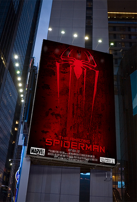
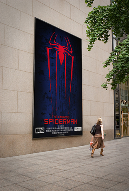
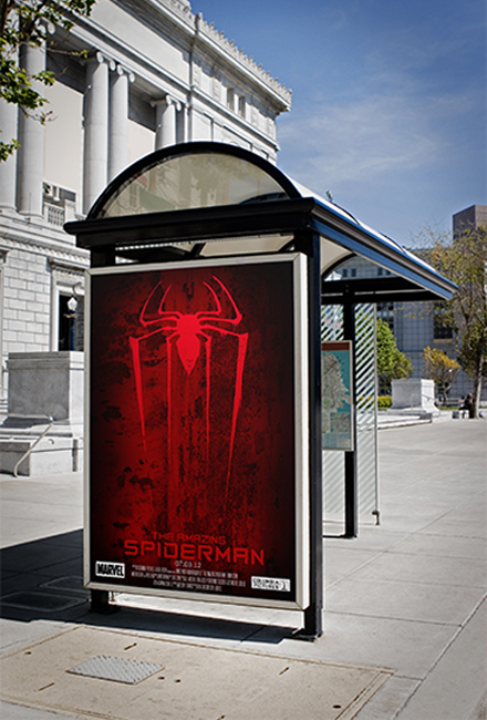
The Amazing Spiderman
This poster for The Amazing Spiderman takes from the darker direction that the new film is taking. The grunge background and the spray painted spider symbol give the feeling of street art that adds to the urban darker feel. NOTE: Some of the designs on my website were done for class, and were mocked up in real life situations.
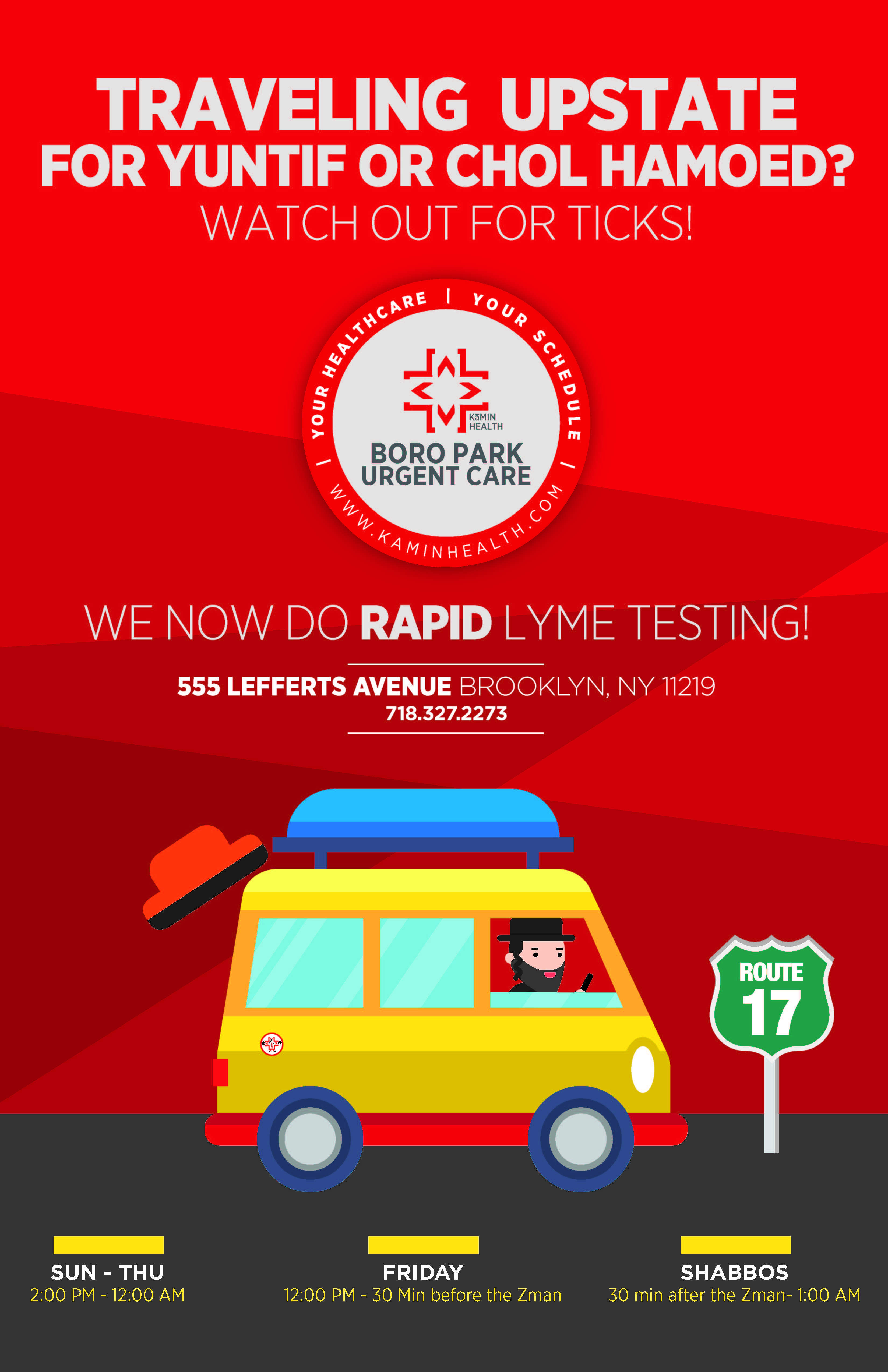
Kamin Health Urgent Care

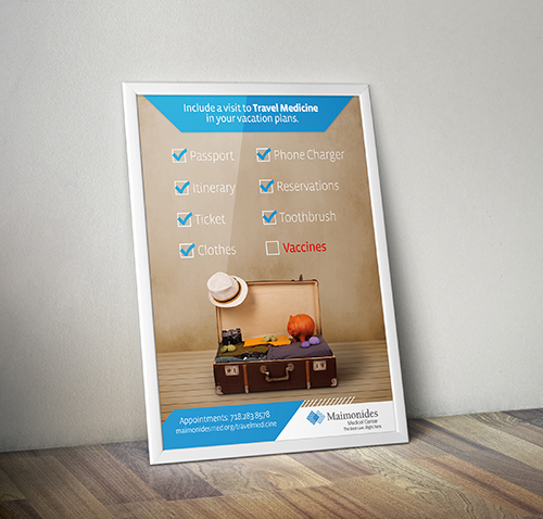
Maimonides Medical Center
This is a poster that I made advertising the Travel Medicine program. I came up with the idea and utilization for the promotion.
Maimonides Medical Center is the largest hospital in Brooklyn. An independent teaching hospital, Maimonides is at the forefront of innovative medicine. My position as Multimedia Coordinator had me create many different types of media.
For other media, see:
Motion Graphics
Flyers
Branding
Infographs
Logo
Webpage Designs
Videos
Converse
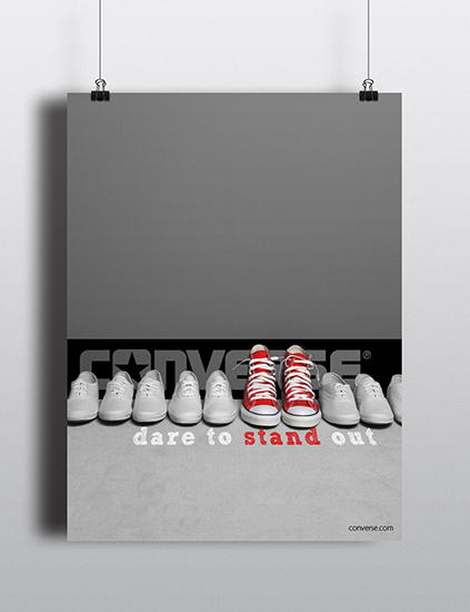
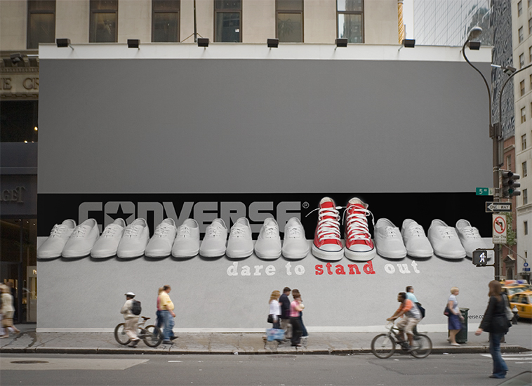
An ad campaign for Converse shoes. This ad urges its viewers to stand out from the norm, and to do what they would enjoy. They should express themselves with a colored Converse that shows their own color.
Capital One
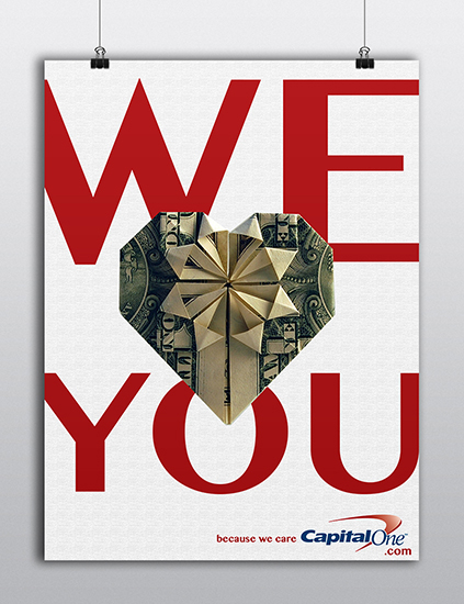
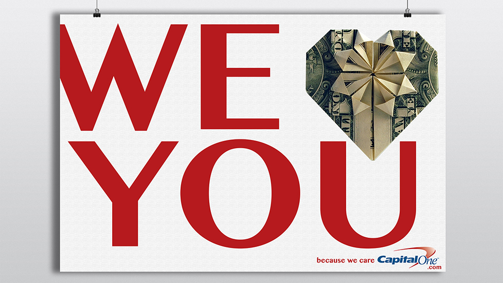
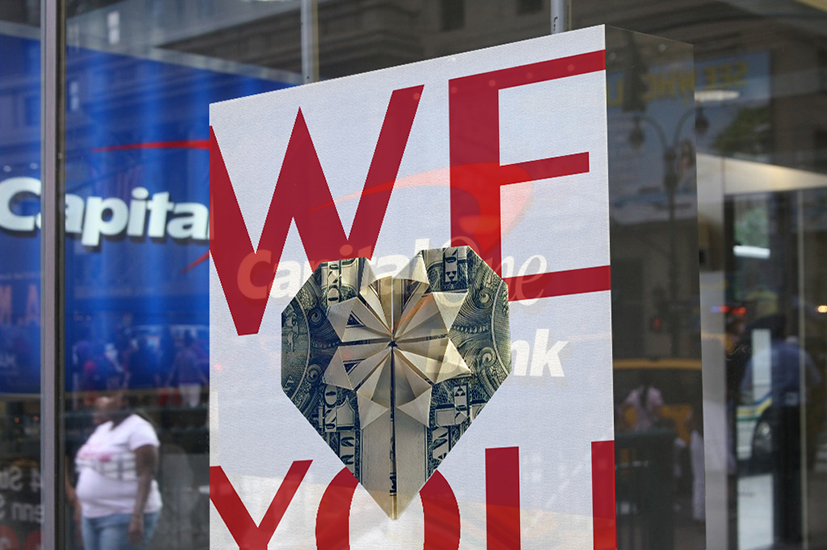
Instead of your usual ad which may sell a product, this campaign is used to create an association of a good feeling with the company. It is meant to show the consumer that the organization cares about them.
Dan Stiles
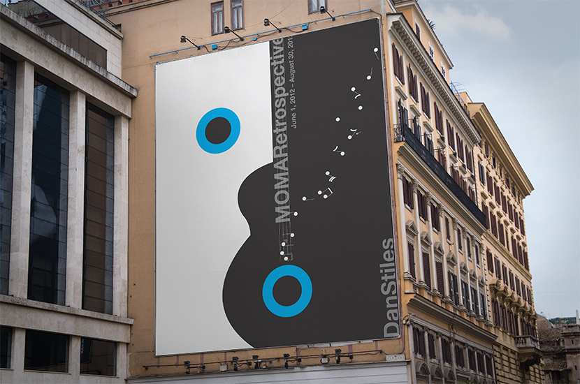
This poster is a tribute to a graphic designer Dan Stiles. After researching his styles and techniques, I made this poster as an advertisement for an exhibit at MoMa featuring his work.
Yeshivat
Netiv Aryeh
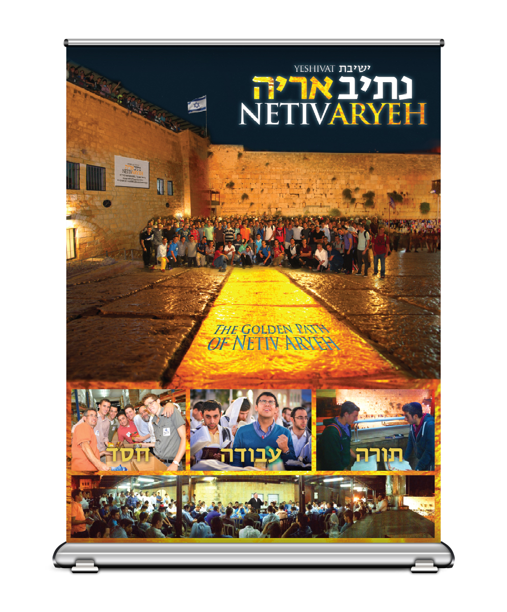
Netiv Aryeh goes recruiting around America every year and they needed a banner to display which showed the warmth and family at the yeshiva. Going with the theme that "Netiv" means path, I decided to base the banner around that. The Golden Path that the Yeshiva leads you along.
Logo
Brochure Example
Shabbat Malka
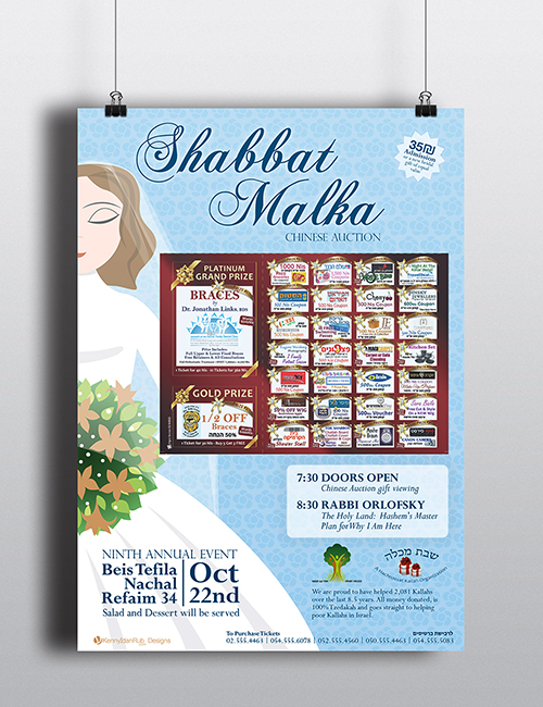
This flyer was made for an organization based in Israel which gives 6 gifts, that are basics, for any new needy bride. The flyer promotes their chinese auction, and it was posted all over the city, and published in a couple of magazines.
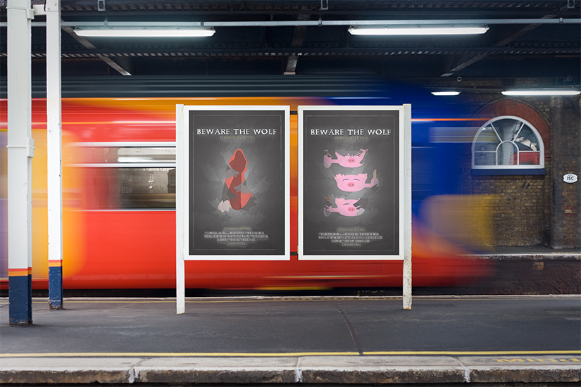
Beware the Wolf
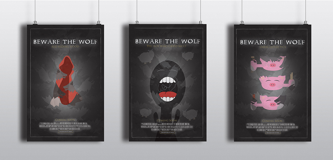
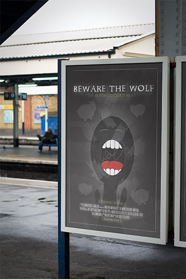
A group of posters for a new series that focuses on the wolf of fairy tales as opposed to the typical protagonist. The posters show the light playfulness of fairy tales with a darker edge, just like the theme of the series.
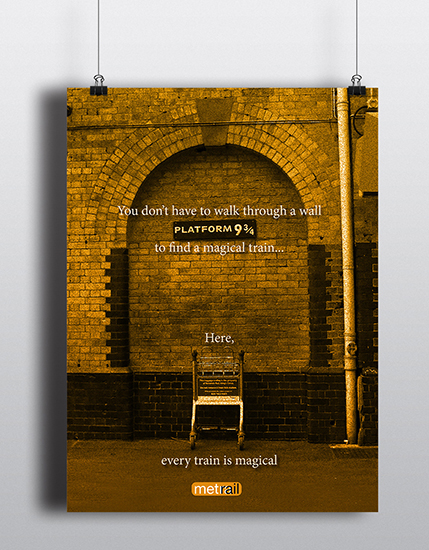
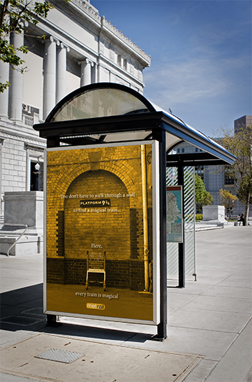
Metra
This poster is a humorous take on the Metra trains. It's part of the redesign of Metra that I also did with the train schedule.
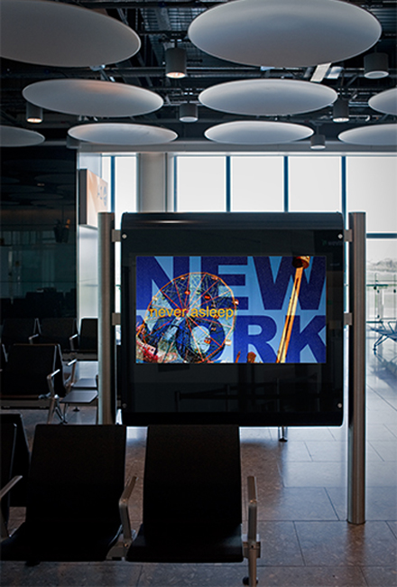
New YorkNever Asleep
This ad is for tourists and people who would be walking through the airport, seeing places they want to visit. It expresses the idea that New York never sleeps by showing landmarks both during the day and at night in the same image.

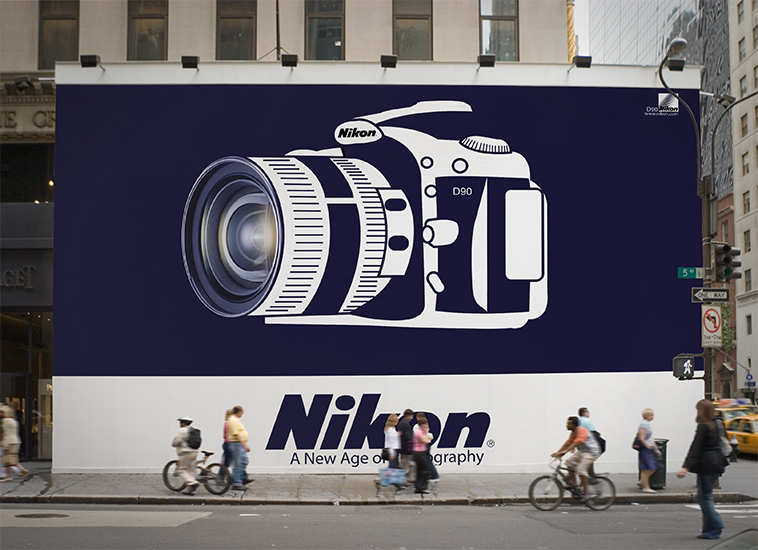
Nikon
We researched and presented a designer in my graphic design class. After presenting the designers history, we had to create a poster for a Nikon camera in the style of the designer. Peter Behrens has a simple style and uses very few colors.
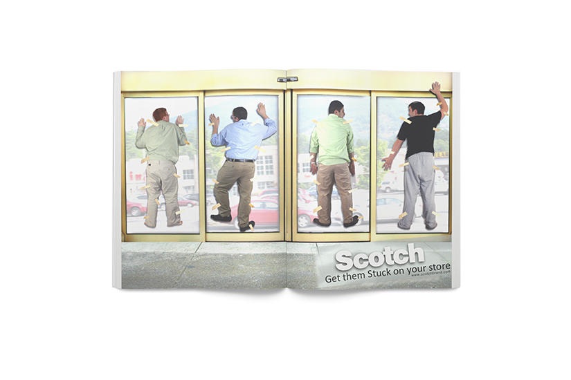
Scotch TapeRetail Ad
This ad would be placed in a magazine geared towards stores that need to stock their shelves with tape. It's for a store like Staples.
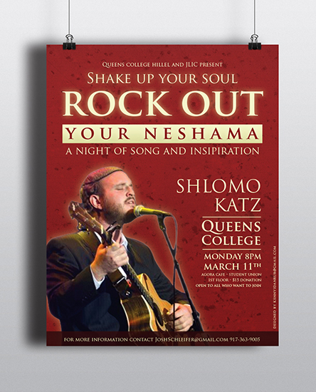
Shlomo Katz Concert
This flyer was made for my college Hillel to advertise a mini concert that was held in the Student Union.
